Overview
Ashcrown is an immersive online game designed for computer play. It offers an engaging one-on-one turn-based experience, encouraging competitive gameplay. Players assemble teams of diverse characters within a captivating heroic fantasy world, including dragons, knights, monsters, and gods. By acquiring characters, players strengthen their teams, earning in-game currency through battles to continuously enhance their roster.
Opportunities & Competitive Analysis
Ashcrown draws significant inspiration from the highly acclaimed game, League of Legends. As a User Interface Designer, one of my primary objectives was to emulate the distinctive UI style of League of Legends.
Challenges
In studying League of Legends’ UI Style, I recognized its emphasis on captivating animations that effectively guide users’ attention to actions and active buttons. Since I wasn’t part of the animation team, I crafted a UI design while considering future animation possibilities. Additionally, considering the game’s future mobile resolution, I ensured a thoughtful design approach to cater to mobile users.
Harmony
To create a seamless user experience, I meticulously developed various textures for panels and screens. This allows each element to blend seamlessly with the game’s universe, enabling players to easily distinguish backgrounds, panels, and buttons at a glance. After iterations, I refined the design by reducing contrast and ensuring that only buttons and in-game illustrations stand out prominently.
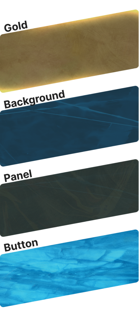
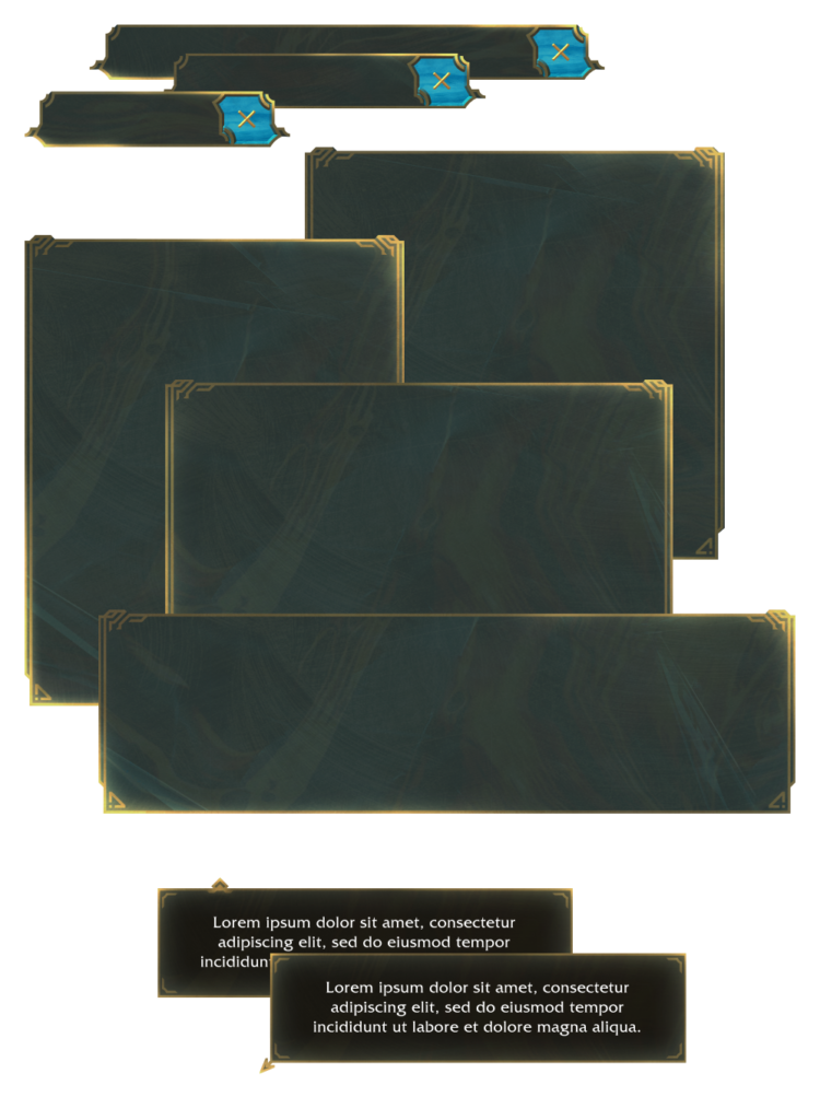
Adhering to these principles, I carefully crafted diverse panels, labels, and tip boxes to demonstrate the versatility of the design system, showcasing the ability to vary element sizes effectively.
Visual Design
Font
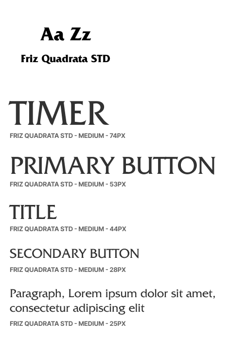
To align with the heroic fantasy theme, I deliberately selected a medium-weight font across all variations. While it may seem unconventional, this choice allows for expressive changes and effective contrast using font size and contextual placement. Ultimately, this approach creates a harmonious design aesthetic.
Buttons
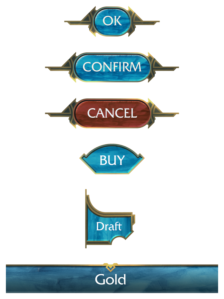
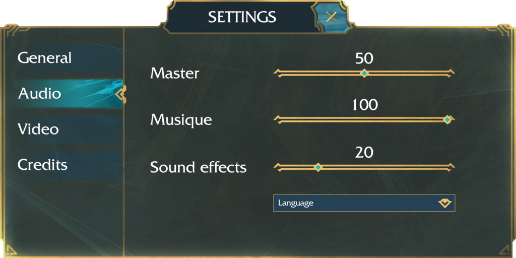
Most buttons feature a sleek capsule shape, while specific buttons adopt shapes that align with their corresponding actions, enhancing user intuitiveness.
User flow
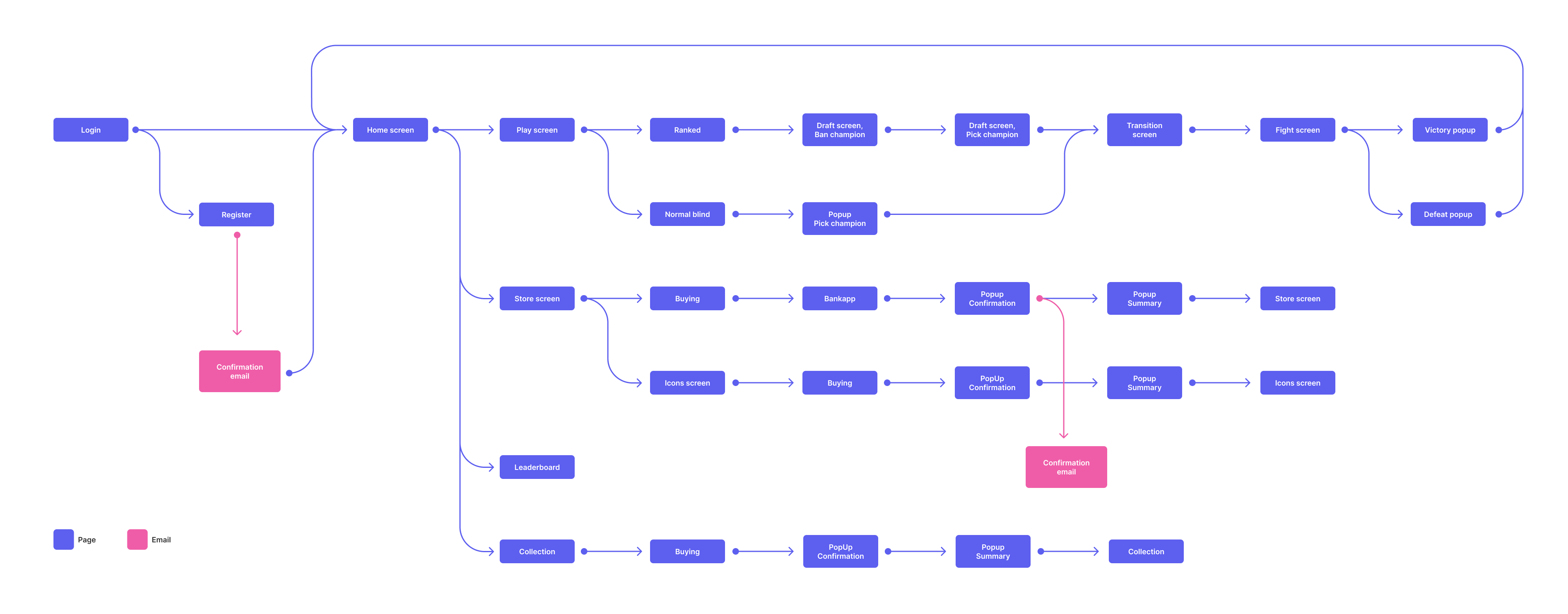
The user flow in Ashcrown is elegantly straightforward. As players progress, their choices guide them through a tunnel-like journey, leading to screens with subtle variations in gameplay, while maintaining consistent UI elements. This deliberate simplicity facilitates familiarity, enabling players to develop habits and gameplay patterns organically.
In-Game Presentation
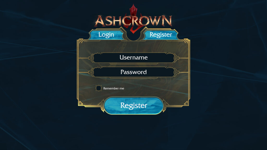
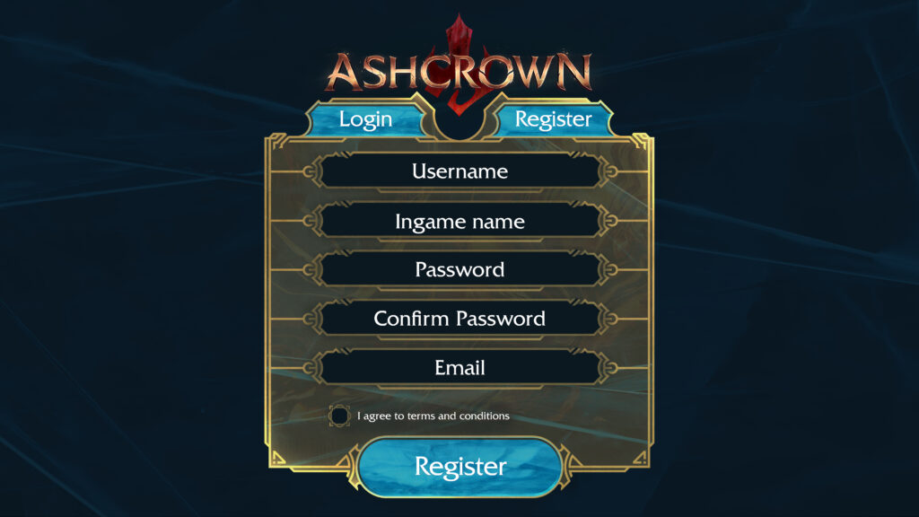
Here, I present a selection of screens, beginning with the Login and Register screens.
Choice Screen
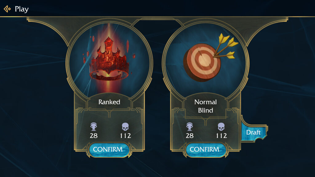
On this screen, players have the freedom to choose their preferred game mode.
Match found
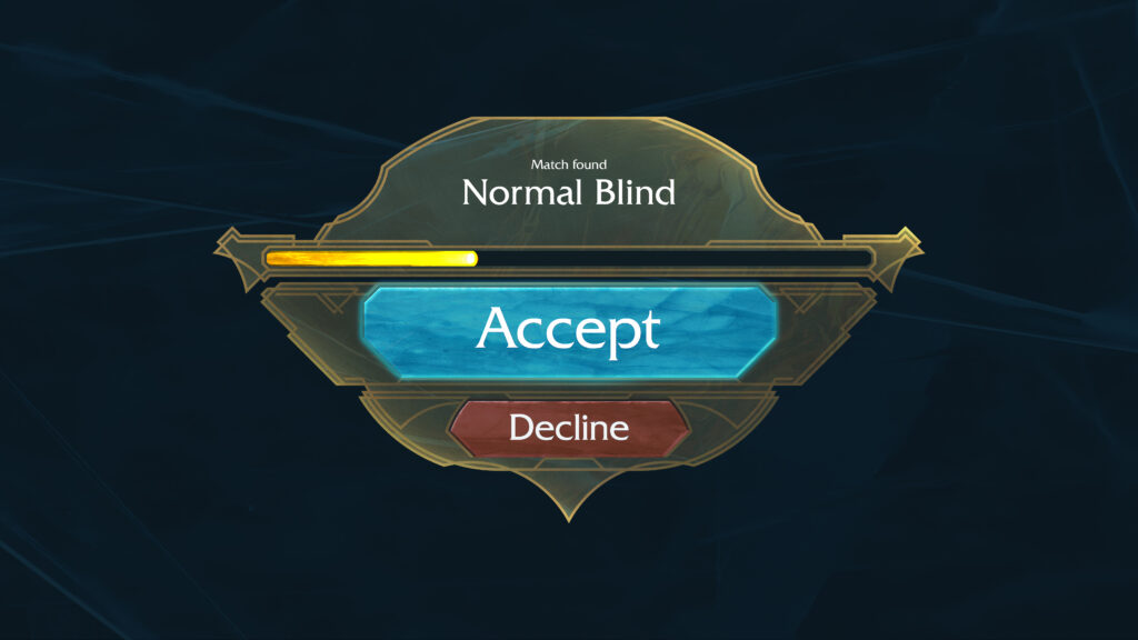
Once an opponent is found, players must accept the match to initiate the game, ensuring engagement even if the opponent stepped away briefly during the matchmaking process.
Draft Screen
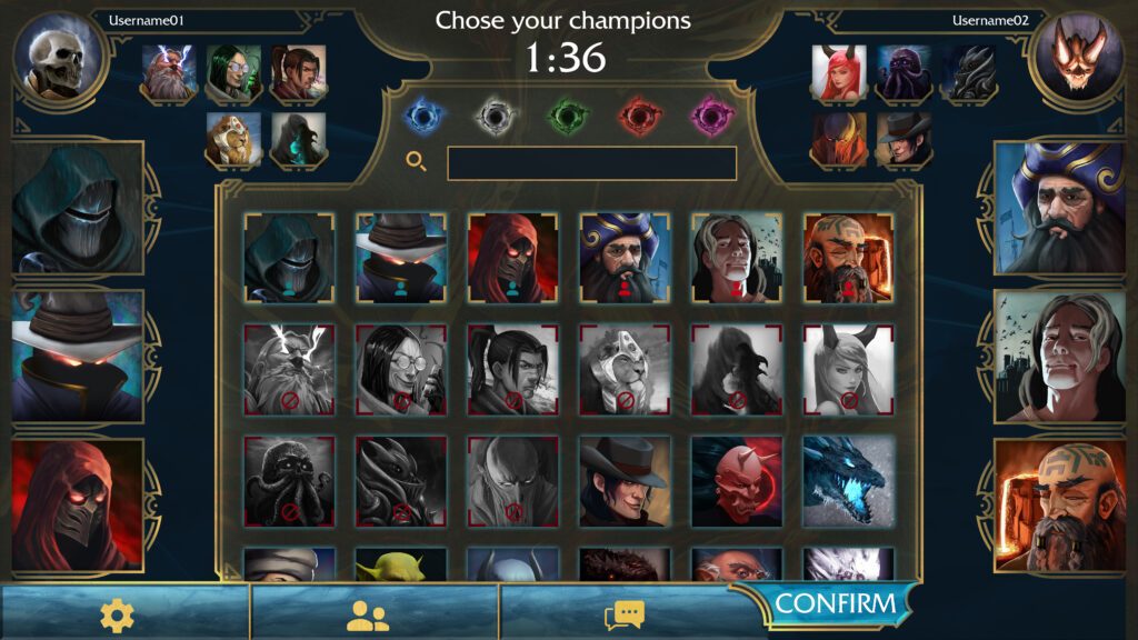
In ranked games, players face a strategic decision-making phase prior to gameplay. Each player ban five characters from the game pool, followed by alternating character choices. Once both players have chosen three characters, the match start.
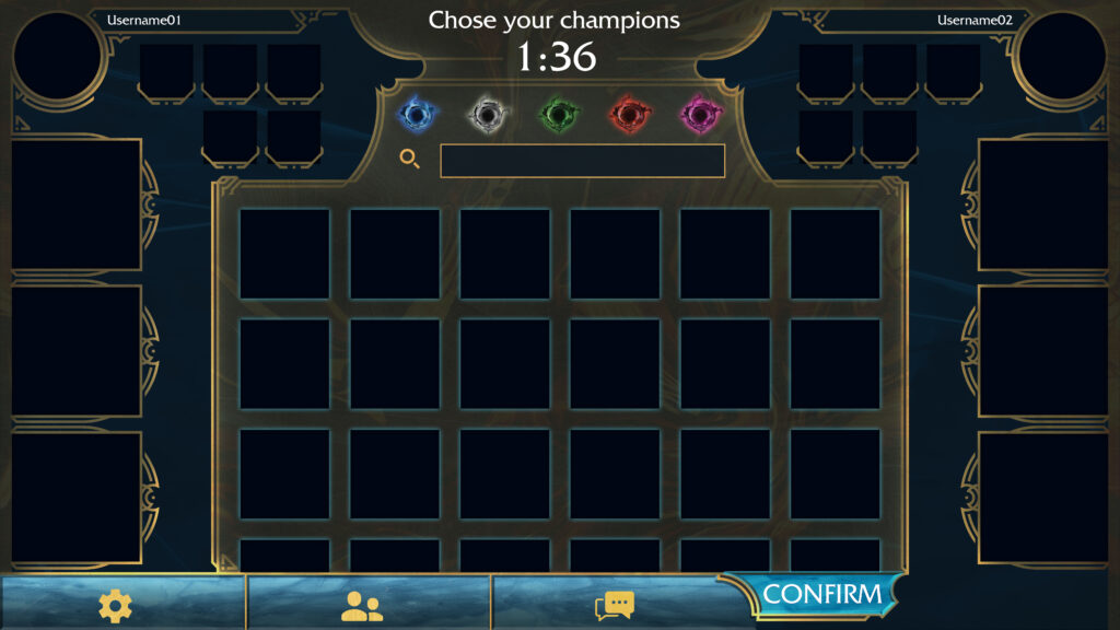
Let’s examine the UI without illustrations, providing a cleaner, less cluttered visual presentation.
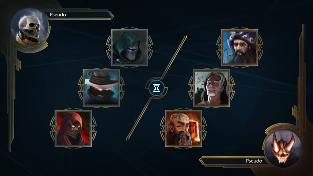
Loading Screen
This screen concisely recaps the player’s choices while the game loads, maintaining engagement during the wait.
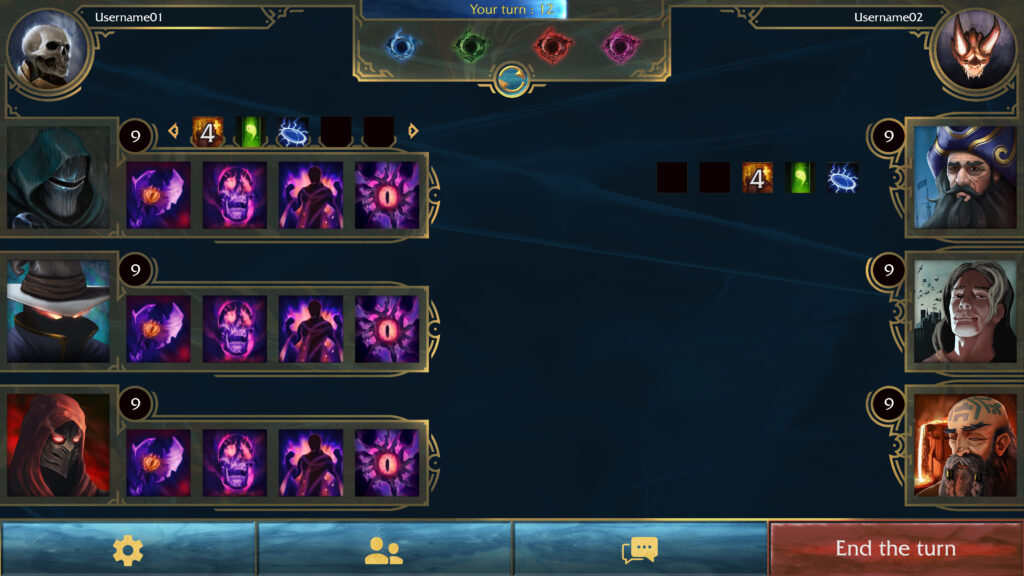
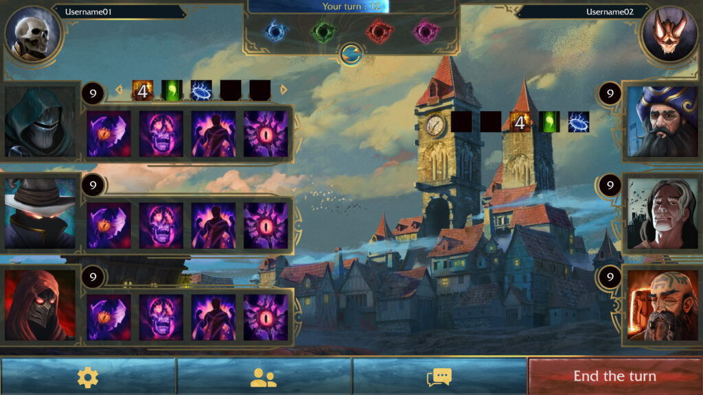
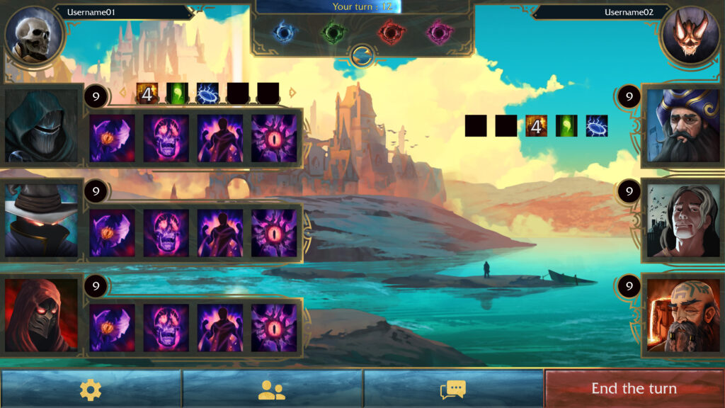
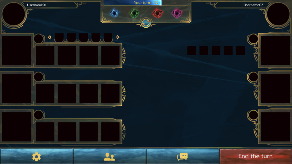
Fight screen
The background dynamically adapts to the player’s level and the characters they utilize, enhancing immersion and visual variety.
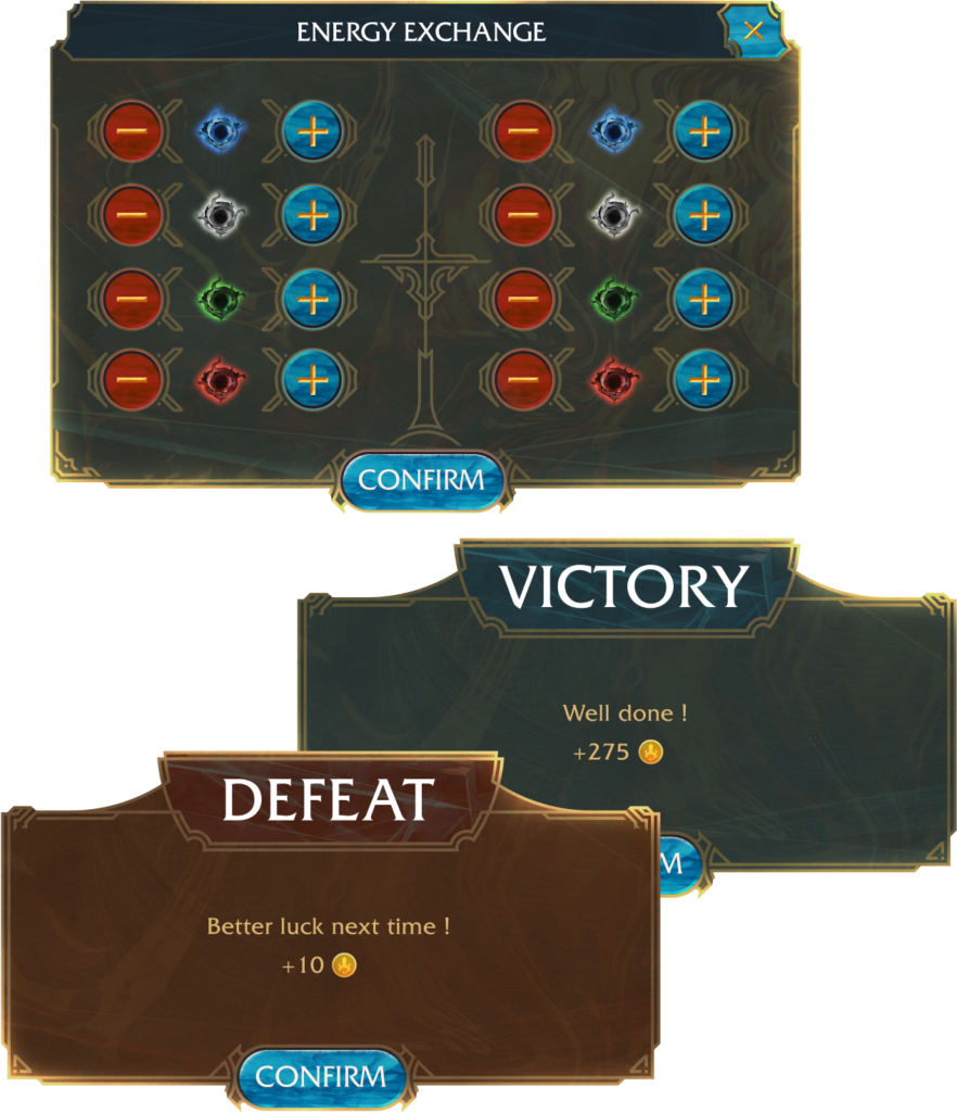
PopUp
These informative pop-ups surface during that specific game stages, providing relevant information to the player.
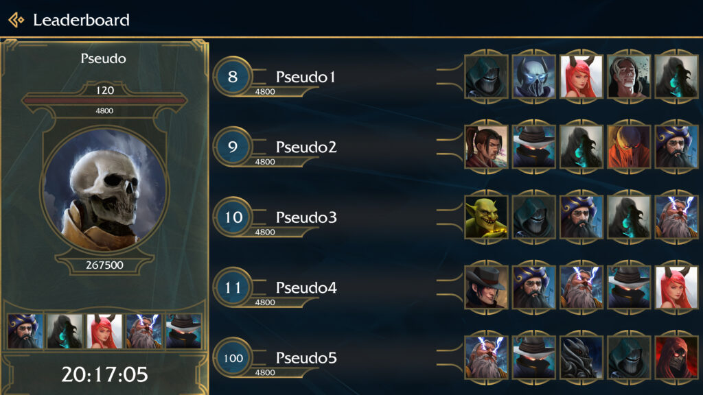
Leaderboard screen
Players can access the leaderboard to review the favored characters used by other players.
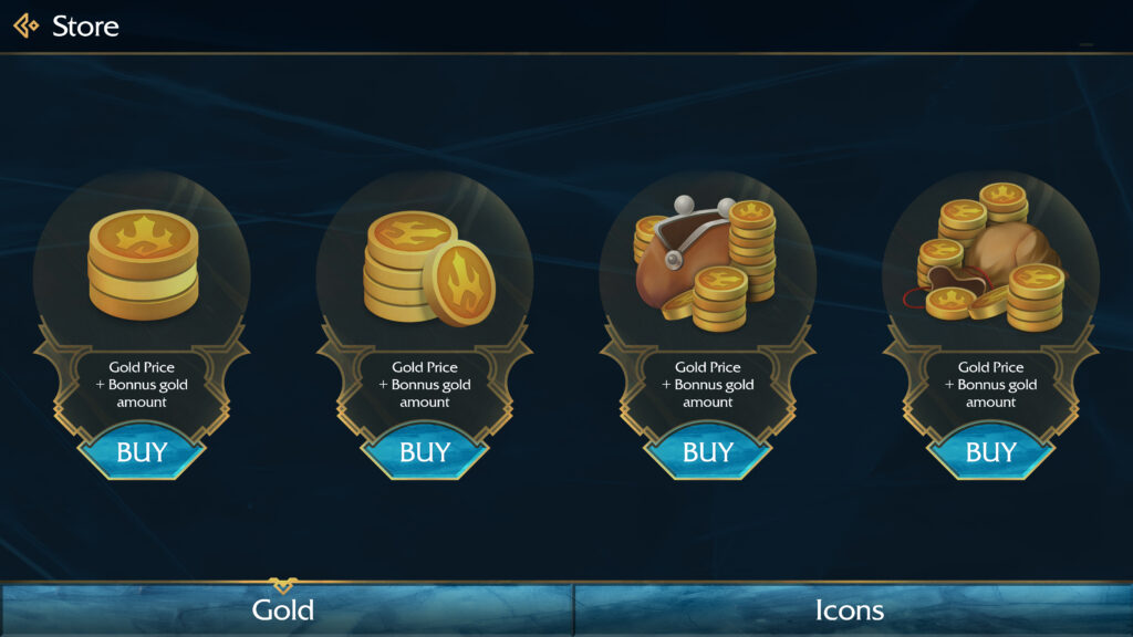
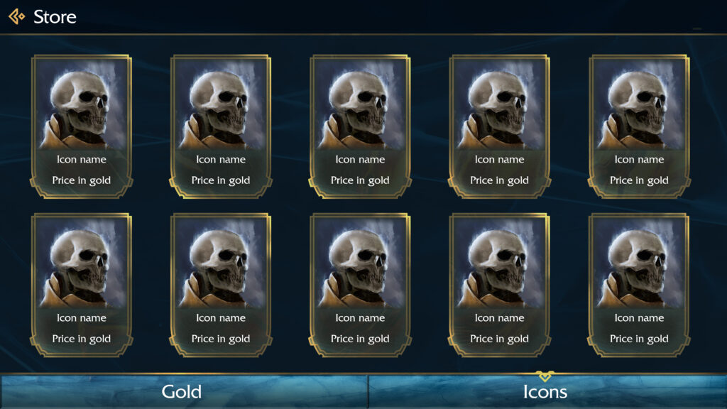
Store
Currently, the game monetization revolves around offering in-game currency, enabling players to purchase characters and cosmetic enhancements.
Future Improvements
Reflecting on the development process, I acknowledge the value of creating a mobile version alongside the computer release, streamlining the development process and optimizing resources.
Given additional time, collaborating with the VFX team to synergize animation and UX expertise would have significantly elevated the game’s overall quality.
Takeaways
- Working on an early-stage game like Ashcrown was an incredibly stimulating experience. It provided me with ample creative freedom, while also instilling a valuable understanding of lean development principles and the importance of focused energy and effort allocation.
- When undertaking projects without a firmly established visual language, proactively defining brand attributes facilitates harmonious design and serves as a guiding compass throughout the project’s visual journey.
