Overview
Reco is a mobile application designed to give people acces to a way of connecting and engaging with sounds. Inspired by the essence of the Reddit social network, Reco provides a platform for users to discover, share, and discuss various audio content. Whether it’s music, podcasts, ambient sounds, or personal recordings, Reco offers a wide community where users can explore and connect through their shared passion for sound.
Opportunities & challenges
Creating Reco presented exciting opportunities and unique challenges. One of the primary opportunities was to tap into the growing trend of audio-based content consumption and provide a space for users to engage with sounds in a meaningful way. By building a community-driven platform, Reco aimed to foster connections and create an immersive auditory experience for its users.
However, designing Reco also posed challenges. One key challenge was ensuring that the platform effectively curated and recommended relevant audio content to users based on their preferences and interests. Additionally, striking the right balance between fostering a vibrant community and maintaining a user-friendly interface required careful consideration. Addressing these challenges would be crucial to the success of the application.
User Research and Project Initiation
To ensure a user-centered design approach, I started the Reco project with comprehensive user research. Through interviews, surveys, and usability testing, I sought to understand the target audience’s needs, preferences, and behaviors when it comes to engaging with audio content. The insights gathered from this research phase were instrumental in shaping Reco’s core features and functionality.
Understanding the diverse user personas was a key aspect of my research. By delving into their motivations, pain points, and usage patterns, I was able to create detailed personas that served as guiding principles throughout the design process. These personas provided invaluable insights into users’ expectations, which informed the development of Reco’s user interface and user experience.
Cards sorting
Card sorting is a valuable UX technique that I employed during the design process of Reco to improve information architecture and enhance user navigation. With card sorting, I presented users with virtual cards representing various features and functionalities of the application. They were then asked to categorize these cards into groups that made the most sense to them. This method allowed me to understand how users mentally organize information, enabling me to create an intuitive and user-friendly navigation structure for Reco. By analyzing the patterns and insights from the card sorting sessions, I optimized the app’s layout, making it easier for users to find and interact with the most relevant content, ultimately resulting in a more seamless and engaging user experience.
Ideation
To address the challenge of curating relevant audio content, Reco utilizes a sophisticated recommendation algorithm that considers user preferences, browsing history, and community interactions. By leveraging machine learning and collaborative filtering techniques, Reco intelligently suggests personalized sound recommendations to users, enabling them to discover new and interesting audio content tailored to their interests.
User flow
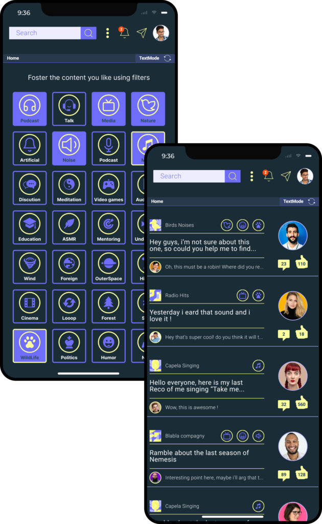
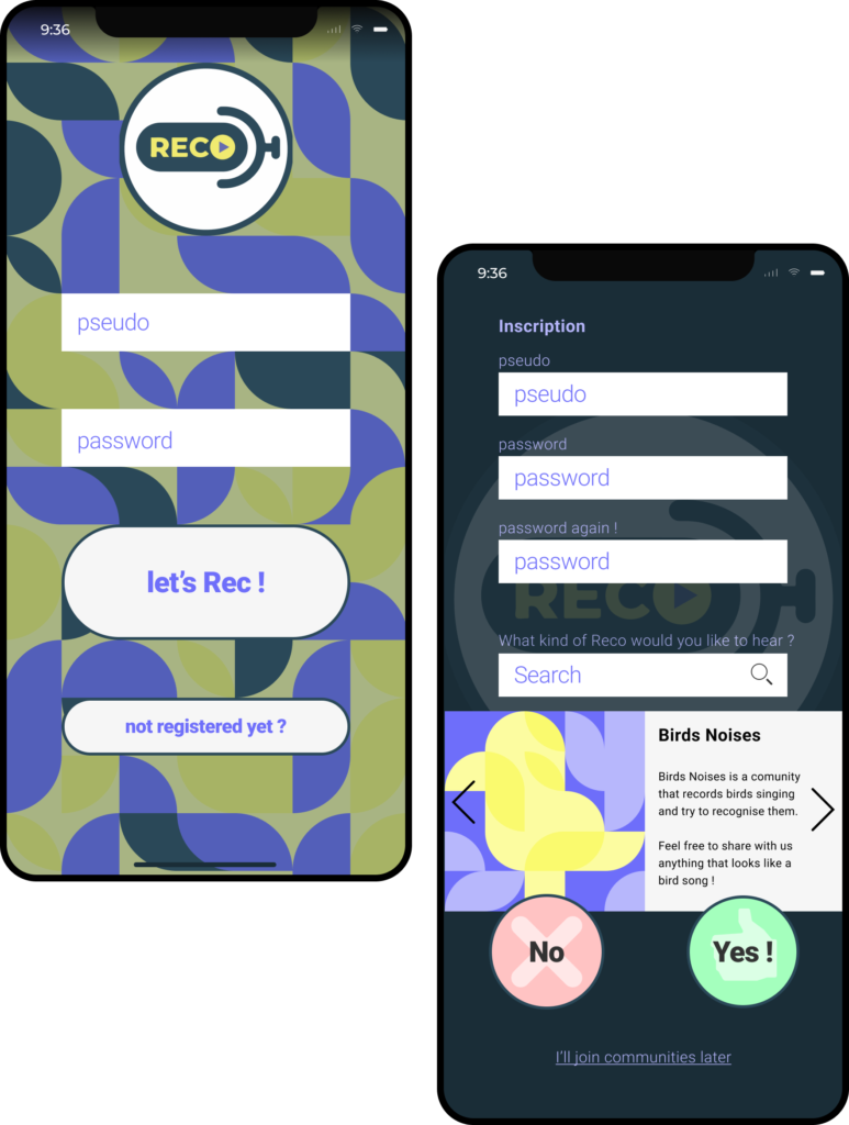
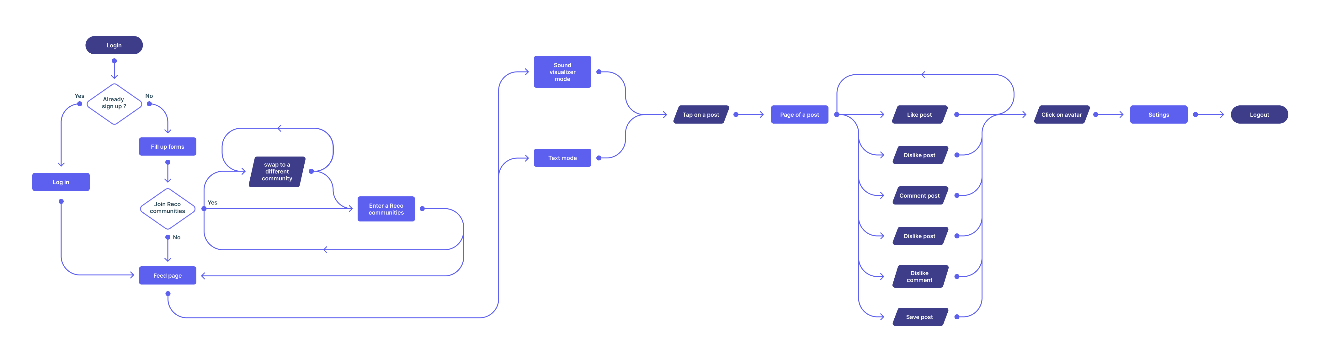
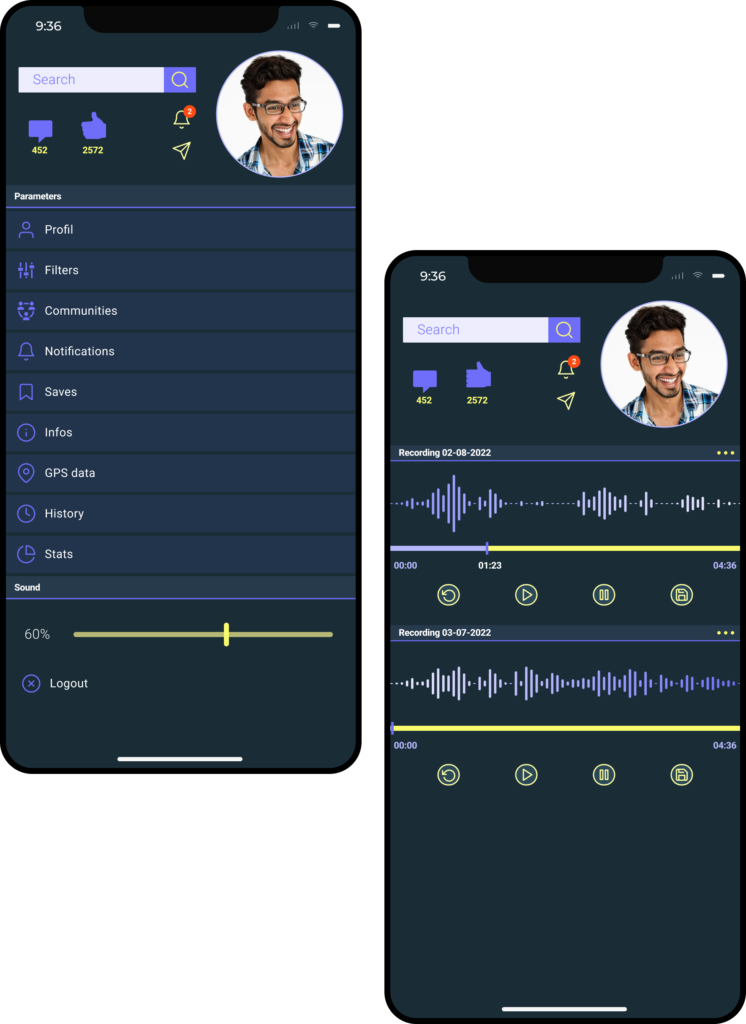
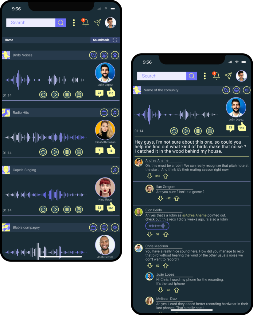
Reco’s user flow is designed to offer a seamless and intuitive experience to its users. Upon opening the app, users are greeted with a welcoming login and registration screen. Once logged in, they can explore various sound-based communities and connect with like-minded individuals. The user flow is carefully structured, guiding users through different sections with ease, allowing them to post sounds, engage in discussions, and discover new connections effortlessly. Reco’s intuitive navigation ensures that users can easily access their profiles, notifications, and personalized settings. This well-structured user flow fosters a sense of exploration, encourages active engagement, and promotes meaningful interactions among Reco’s vibrant community of sound enthusiasts.
Information architecture
Maintaining a balance between community engagement and usability, Reco features intuitive navigation and a seamless user interface. With a clear and structured information architecture, users can easily navigate through various sound categories, participate in discussions, and form connections with like-minded individuals. To ensure inclusivity, Reco adheres to accessibility guidelines, making the platform accessible to users with different abilities.
Comunity driven content
Reco’s content is driven by its active communities, functioning similarly to Reddit’s communities. Users have the freedom to create and join various communities based on their interests and passions. Each community serves as a dedicated space where users can share, discuss, and engage with sound. Whether it’s about music, talk, technology, or any other niche, Reco’s diverse communities brings a sense of belonging and encourage users to contribute, comment, and vote on posts. This community-driven approach empowers users to shape the platform’s content, ensuring that Reco remains dynamic, relevant, and reflective of the collective interests of its engaged users.
Visual Design
Throughout the design process, I focused on creating a cohesive visual identity for Reco. From typography choices and color palettes to iconography and visual consistency, the visual design of Reco reflects its dynamic and immersive audio-focused nature. Additionally, I developed a comprehensive design system to ensure consistency and scalability across the application.
Font
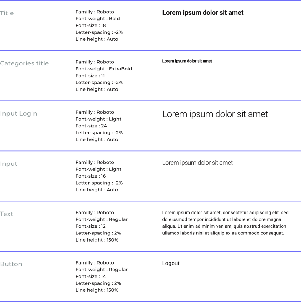
In the development of the Reco application, every design element was carefully considered to provide users with a seamless and enjoyable user experience. Among these key design elements, the “Roboto” font was strategically chosen to reinforce visual harmony and improve readability within the interface.
As a UX designer, I paid meticulous attention to every aspect of typography to create a cohesive user experience. “Roboto,” a sans-serif font developed by Google, proved to be an ideal choice for Reco due to its legibility and versatility.
Colors
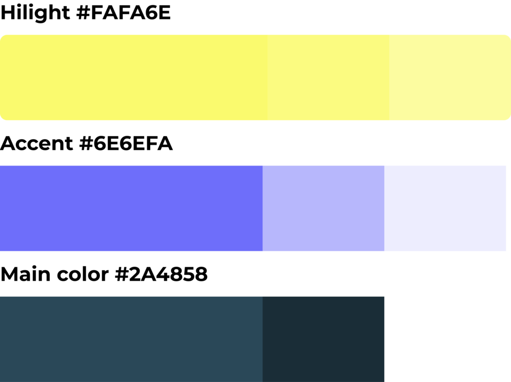
In the design of Reco, the color palette plays a crucial role in conveying meaning and enhancing the user experience. The three main colors were carefully chosen to evoke specific emotions and associations. The vibrant #FAFA6E yellow represents positivity, energy, and draws attention to important elements like buttons and calls to action. On the other hand, the soothing #6E6EFA blue reprsent a sense of trust, calmness, and complements the yellow to create an appealing and harmonious visual balance.
The complementarity of the color palette ensures that essential information stands out, to maintain readability and accessibility. For example, important alerts and notifications are strategically placed in contrasting colors to catch users’ attention immediately.
Furthermore, the carefully chosen color combinations enhance the overall UX by creating a cohesive and visually pleasing experience. Consistency in color usage nurture familiarity, making it easier for users to navigate and interact with the app seamlessly.
Overall, Reco’s color palette not only reflects the brand’s personality but also elevates the user experience by guiding users, communicating meaning, and providing a visually engaging interface. As the main UX and UI designer on the project, these color choices were instrumental in shaping Reco’s identity and optimizing the user’s journey.
Conclusion
The creation of Reco has been a transformative journey for me as a UX and UI designer. Through this project, I have honed my skills in user research, design thinking, and visual aesthetics. Reco taught me the importance of placing the user at the center of every decision, striving to create an intuitive and enjoyable experience.
Reco was a way for me to design engaging and impactful digital experiences that resonate with users on a deep level.
Takeaways
- The user research phase was pivotal in understanding the needs and expectations of potential Reco users. It allowed me to identify key functionalities, such as communities filters, which added a real sens of personalization to the application.
- Additionally, the process of defining user personas helped me empathize with users, ensuring the design catered to their specific preferences.
- Throughout the design and development stages, I embraced the challenge of creating a seamless and visually captivating interface. Utilizing the vivid colors in addition to darker tones of the background proved to be a well-founded choice, enhancing legibility and establishing a harmonious design language. By prioritizing visual hierarchy and consistency, I provided users with a cohesive experience across the application.
However, if I had more time to work on the project, I would focus on two primary areas of improvement.
- Firstly, I would invest in further user testing and feedback collection to fine-tune the user experience. By incorporating direct user input, Reco can evolve into a more tailored and user-friendly platform.
- Secondly, I would explore expanding Reco’s feature set, such as introducing personalized sound preferences and enhancing social sharing capabilities. These additions would enrich the user experience and help to create deeper connections among users.
Overall, Reco has been an enriching project that has allowed me to expand my UI and UX design skills. It has taught me the importance of embracing user feedback, continuously iterating designs, and staying attuned to emerging trends in the field. With a commitment to user-centric design and a willingness to adapt, I look forward to crafting even more innovative and impactful user experiences in the future.
Checkout my other projects