Overview
Schooltopia is an immersive online platform designed specifically for college students seeking to enhance their mathematical skills and knowledge. By employing story-driven courses and fostering empathy, Schooltopia effectively engages students in the learning process.
Role and Expertise
As the principal UI/UX designer at Schooltopia from 2022 to 2023, I had the privilege of leading the design efforts. This project was a transformative experience, allowing me to deepen my understanding of UX research, surpassing my previous professional endeavors.
Opportunities & Competitive Analysis
Opportunities & Competitive Analysis: While numerous e-learning platforms cater to a wide audience, Schooltopia stands out by targeting college students and employing a unique approach. By incorporating captivating storylines conveyed through comics, our platform offers a dynamic learning experience that fosters empathy and engagement. Additionally, the time-bound nature of the story-driven courses creates rhythm, further enhancing the learning journey. My design process primarily focused on amplifying the storytelling aspect to elevate user engagement.
Challenges
The primary challenge we encountered was creating content that resonated with students while addressing the concerns and expectations of parents. With two distinct user groups possessing different goals and frustrations, the task of designing for both proved stimulating as a UX designer.
Interviews, Surveys
& A/B testing
Interviews, Surveys
To gain valuable insights, I conducted interviews and surveys with users who subscribed to both the free and paid versions of our platform. Using the provided phone numbers, we engaged with users to better understand their needs.
Goals
- What are the pain points users have experienced during the subscription phase ?
- Was any information asked in the subscription form difficult to answer ?
- To what extent are digital tools already being used for learning ?
- What is the preferred support to learn online ?
A/B testing
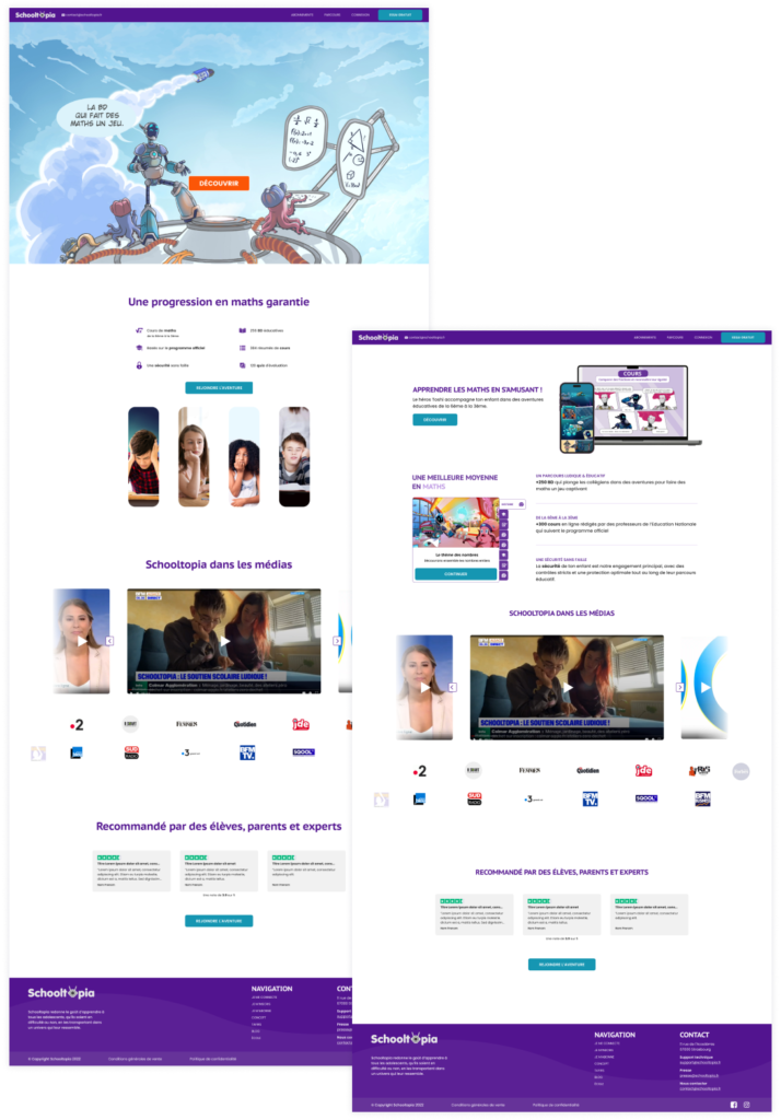
Additionally, we performed A/B testing with four variations on the landing page, modifying the main visuals and button colors to gauge user preferences.

Results on interviews & surveys
We realized that a big part of our newly subscribed users were actually students that got curious seeing our ads online and ended up subscribing to be able to read the comic.
Since the subscription route and the form were meant for the parents, those students had trouble filling up the form. They also got scared by the paid plan which was pushed forward to transform more free subscriptions into paid ones.
Our contact with parents further revealed the need for reassurance and a desire to explore course functionalities before committing to the paid plan. Additionally, we discovered that some parents, mostly mothers, were eager to collaborate, offering to provide online reviews of the platform on their Instagram accounts, thereby providing a valuable marketing opportunity and instilling confidence among parents.
Results on A/B testing
The landing page featuring vibrant paintings and characters resonated well with students, while the more serious and informative second page appealed more to parents.
As for the button color test, no strong user preference was evident. Therefore, we decided to opt for cyan buttons, which helped foster user reassurance.
Deductions
Based on these findings, we devised separate user routes for our distinct user groups.
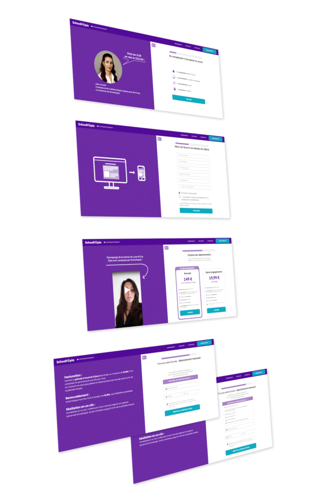
- For parents, our focus centered around building trust and highlighting the platform’s reliability. We integrated Instagram mother’s videos, complemented by concrete information about the courses.
- For students, we prioritized showcasing the captivating comics and removed the choice for subscription, as most students on the platform opt for the free plan.
Building empathy
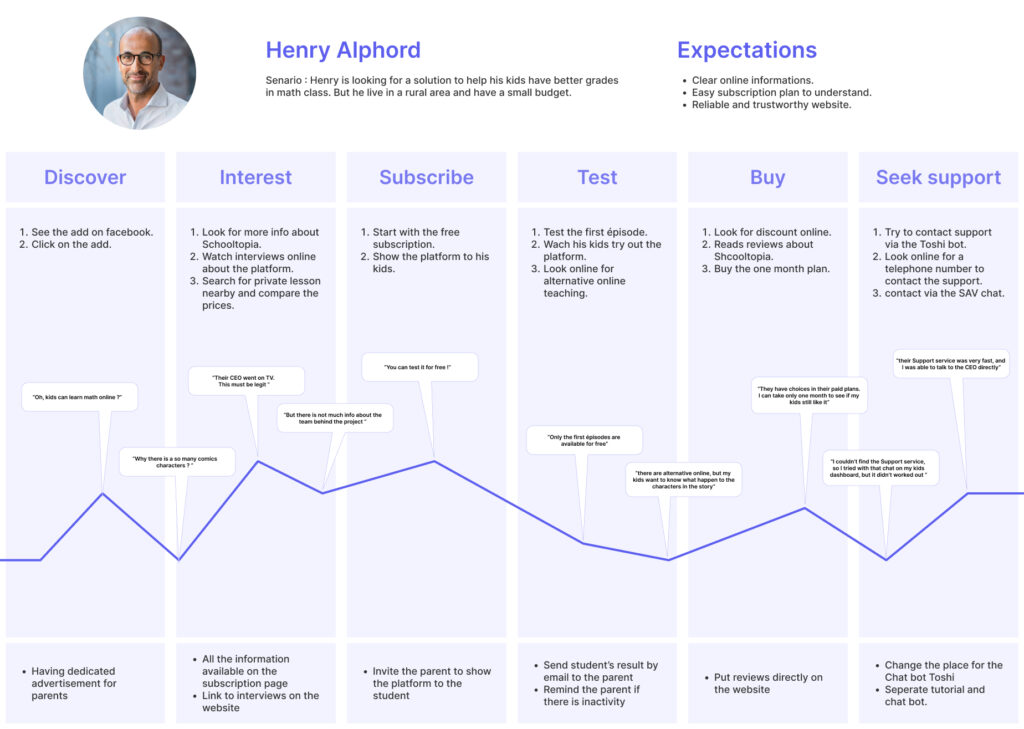
Personae
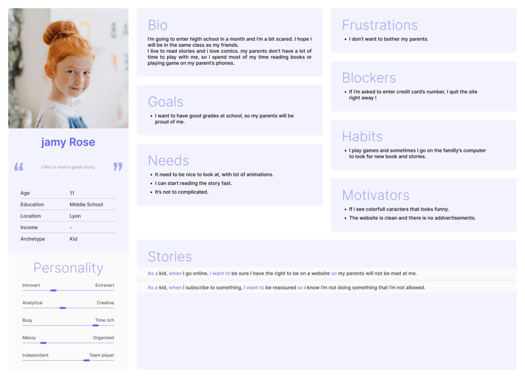
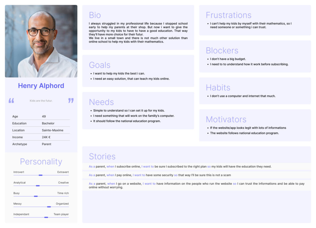
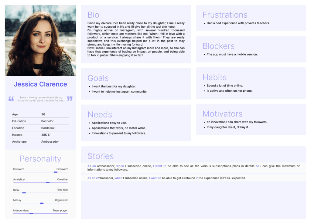
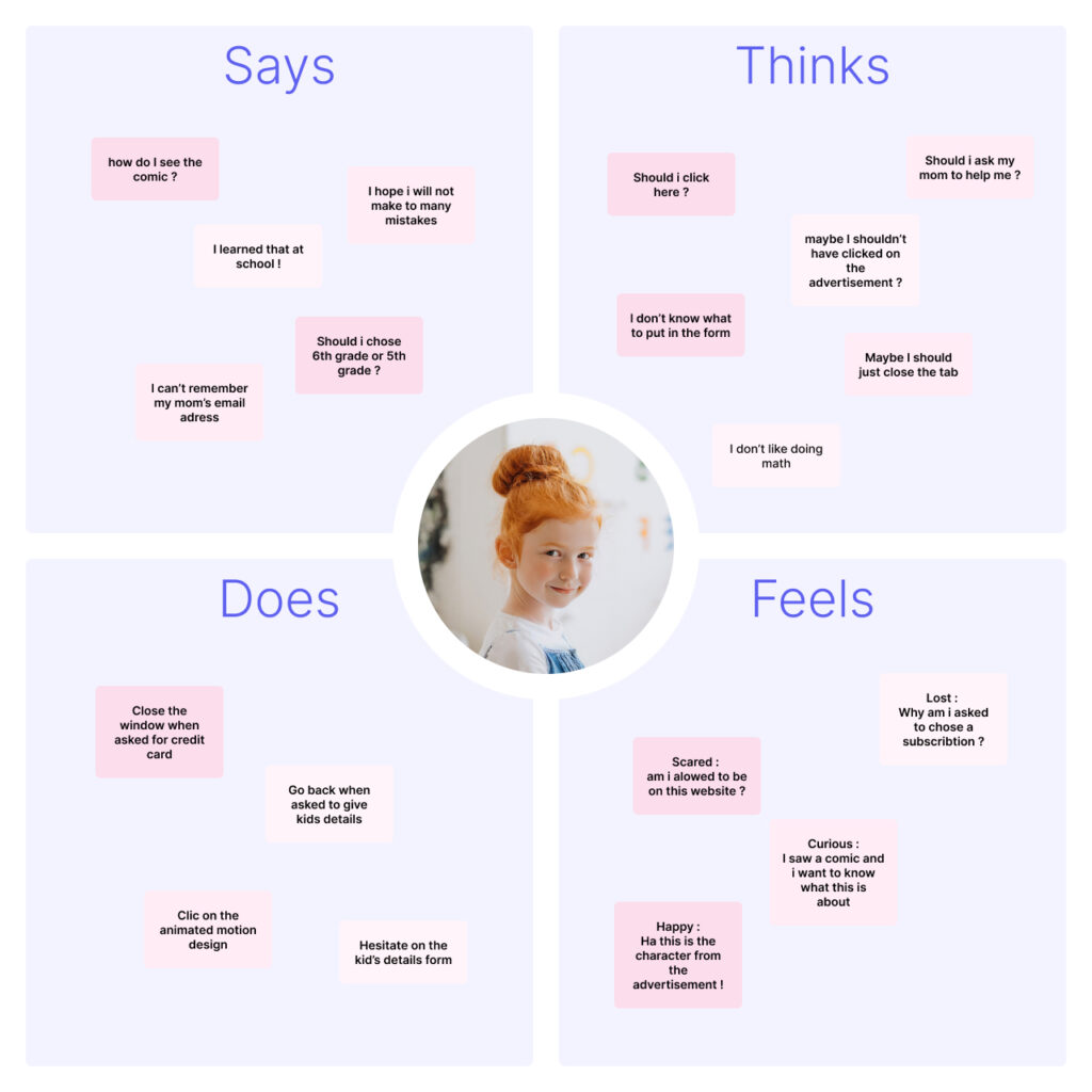
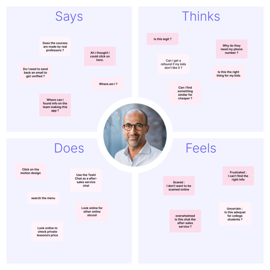
By leveraging qualitative and quantitative data derived from interviews, surveys, and A/B testing, I developed three target personas: Jamy Rose (student), Henry Alphord (parent), and Jessica Clarence (Instagram mother). This empathetic approach allowed us to better understand our user groups and prioritize goals aligned with their specific needs.
Empathy map
Visualizing user attitudes and behaviors through empathy maps provided invaluable insights. It helped our team gain a deeper understanding of end-users, identify potential gaps in user data, and refine our design approach.
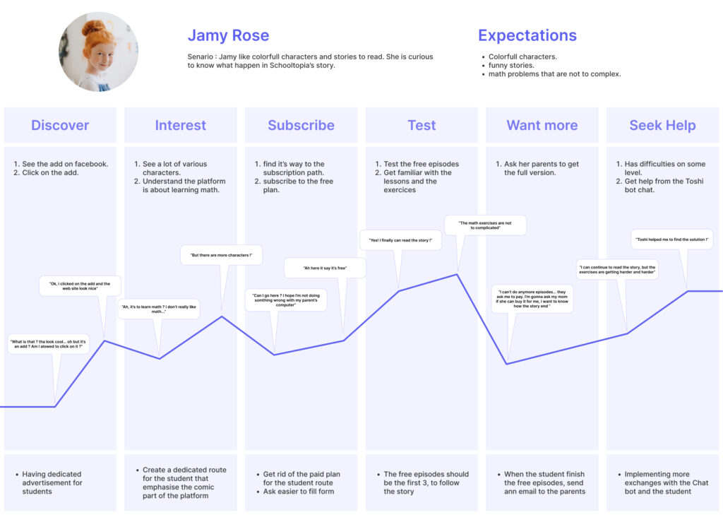
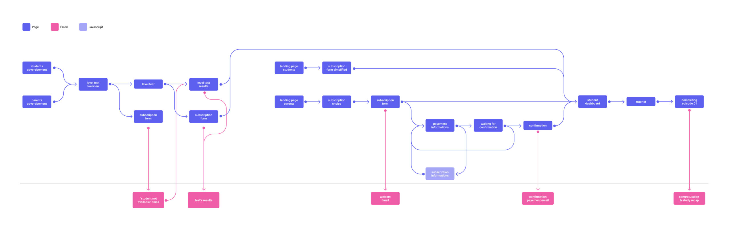
Re-Design of the user flow
Armed with insights from content analysis, competitor research, and a clear understanding of our target users, I meticulously redefined the user flow to optimize the overall experience.
Visual Design
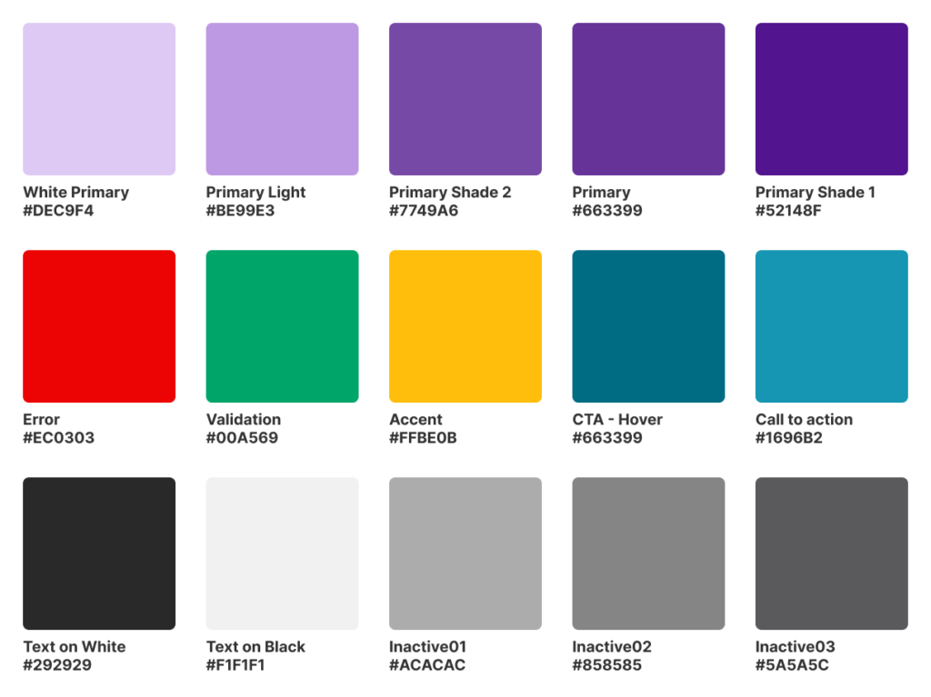
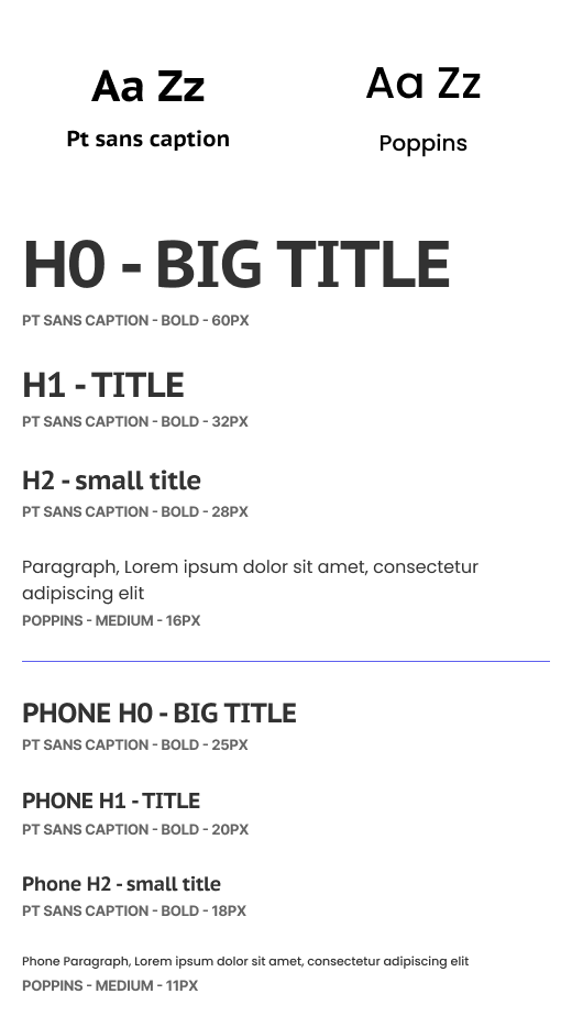
Colors
To achieve visual contrast while maintaining design harmony, I employed a gradient derived from our main color (violet). Neutral colors such as white, greys, and charcoal grey were utilized for text, while more saturated and bright colors were reserved for buttons and important text, such as error messages, ensuring clear differentiation.
Buttons
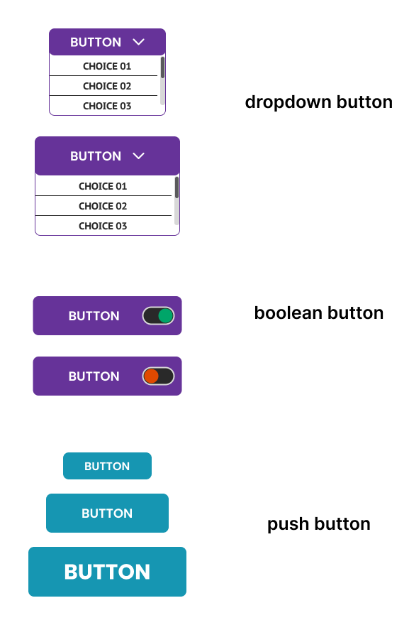
Given the extensive user interaction within the platform, I prioritized clear button design to facilitate user understanding of actions.
Drop-down and boolean buttons, which typically do not lead to new URLs, were designed with violet, while push buttons that navigate to new URLs were given a cyan color.
Font
During A/B testing, we experimented with various fonts, including a more playful and rounded option that appealed to children. However, we found that the parent target responded less favorably, leading us to choose a more serious font to strike the right balance.
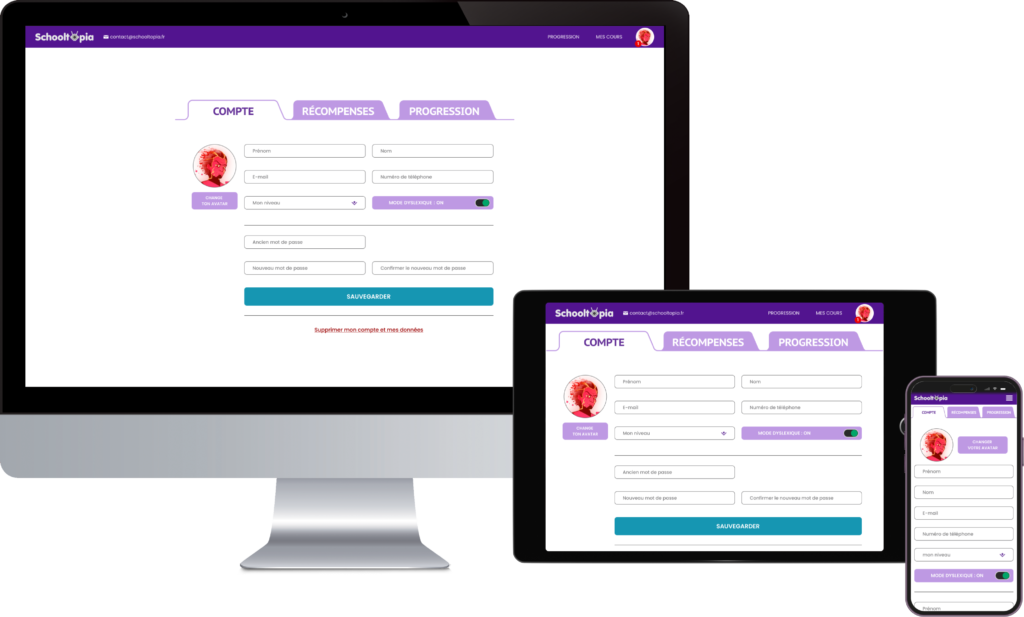
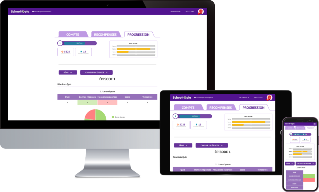
Responsive design
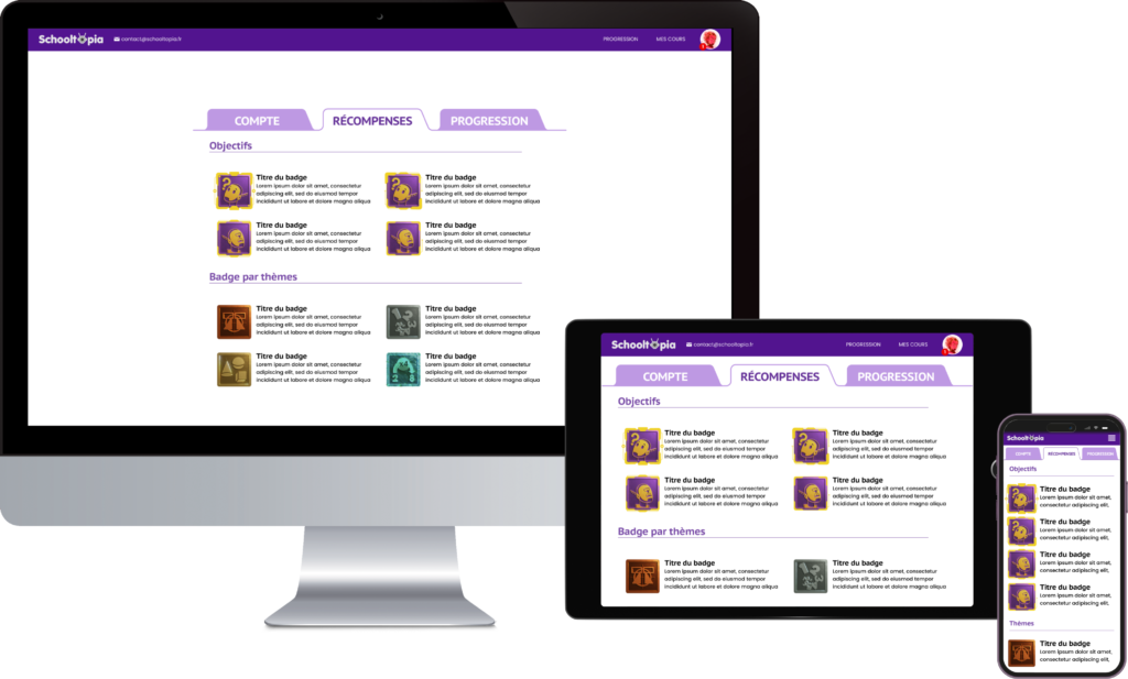
Considering the preferences of our users, we ensured the platform was responsive and adaptable across devices. Half of our users preferred computers, while the other half used mobile devices, with a minority using tablets. Our design accommodated all users seamlessly.
Aspect of game design
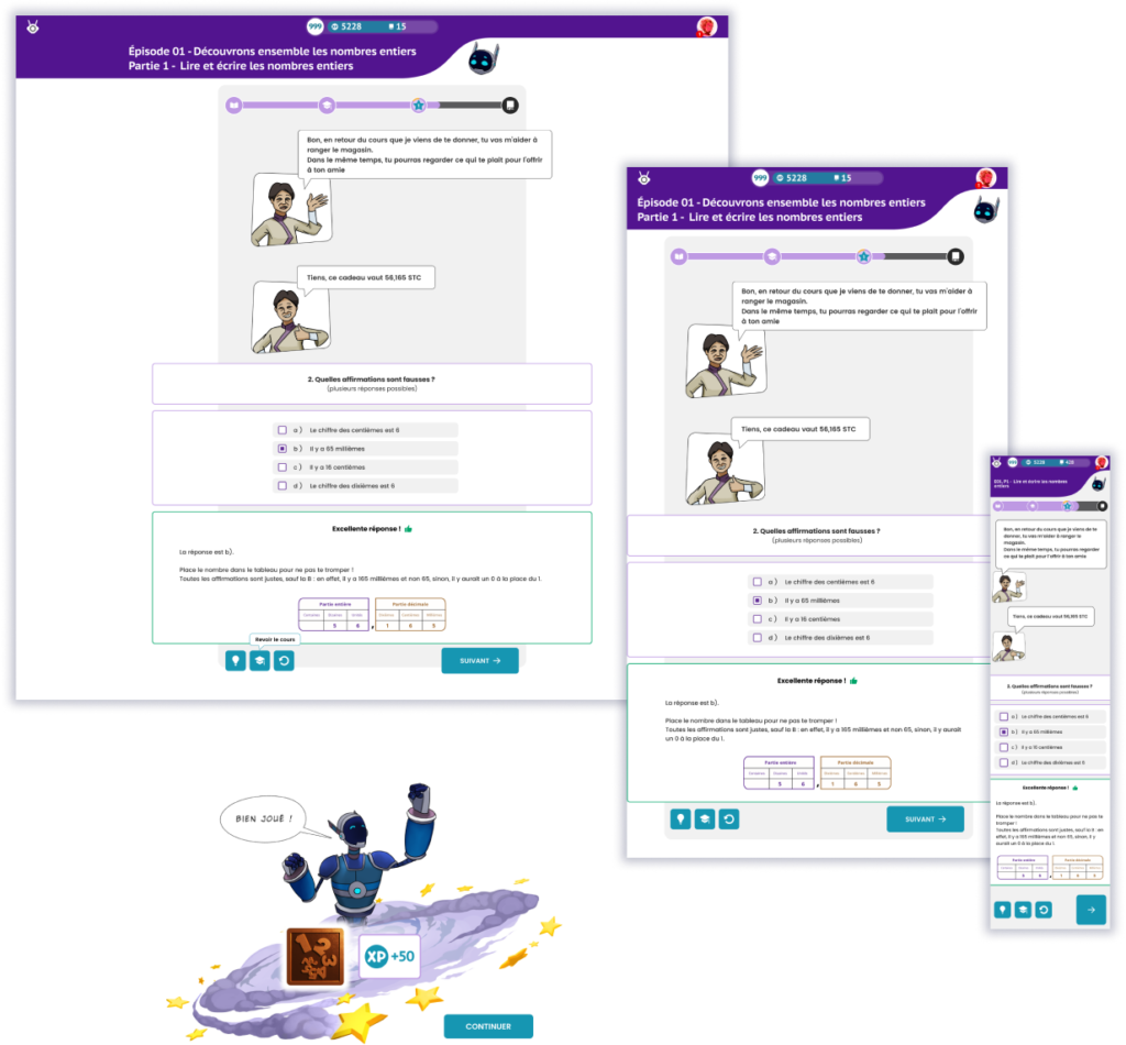
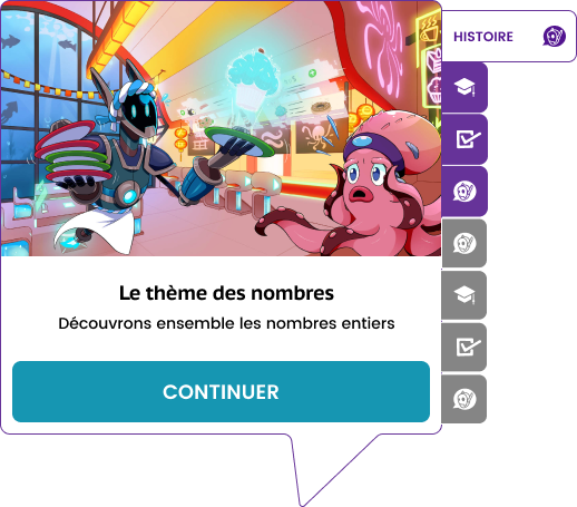
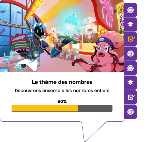
Drawing inspiration from video games, Schooltopia integrated game design elements to enhance user retention and encourage frequent platform usage. Notably, a point system visible at all times in the header. I also added a level system which is connected to the point you gather throughout the courses.
Here the challenge was to bring a game design aspect while not putting too much focus on it. This is meant to be subtle but understandable at first glance.
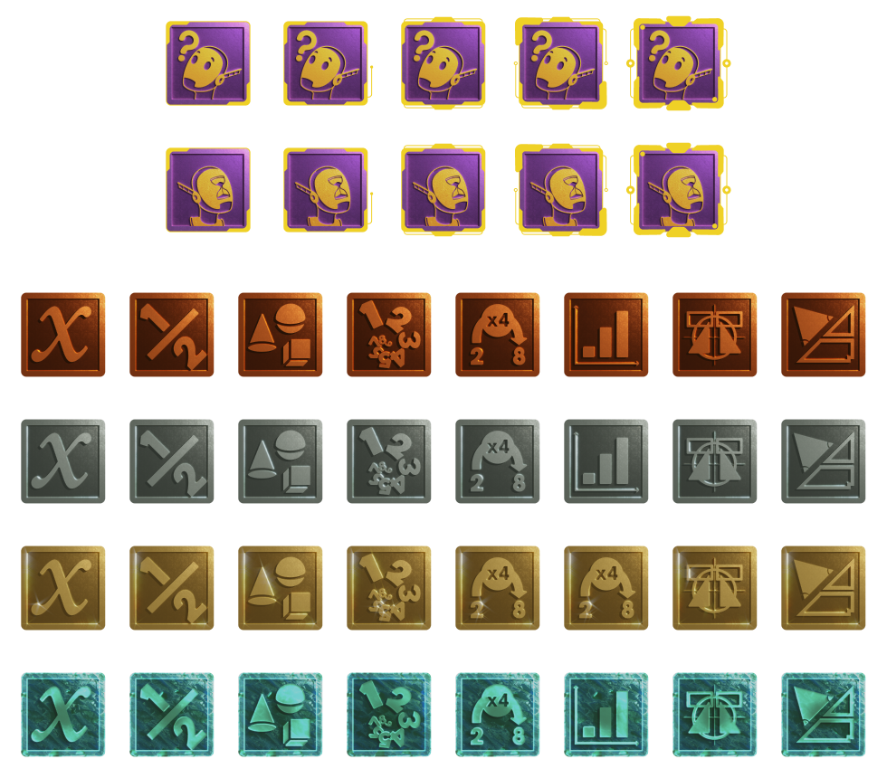
Design of the badges
Badges serve as rewards for completing specific courses or achieving milestones, such as time spent or questions answered
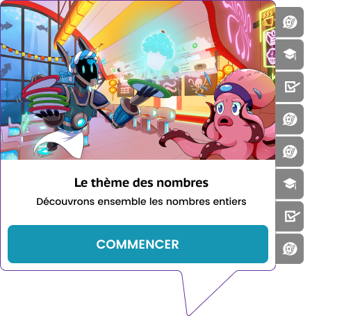
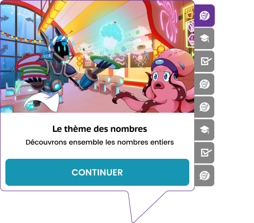
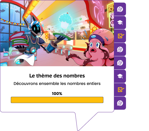
Starting a lesson
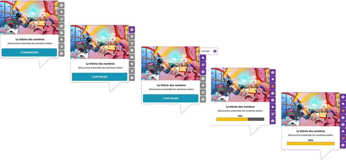
To give as much freedom to the students regarding the way they navigate from one course to another, I created a tab menu that updates when the content is finished on their dashboard.
That way they can come back to any previous lesson and go straight to where they stopped last session. Or they review an exercise which they did answer correctly to manage to get it at 100%.
They can also just enjoy re-reading the online comic !
Results & takeaways
Results
With the implementation of the distinct routes for parents and students, we have seen a significantly increased number of subscriptions as well as a decrease in the number of complaints lodged through the customer service.
Additionally, I have received positive feedback from users about the way they can navigate in their dashboard and have more freedom regarding their interaction with the platform.
Takeaways
Dealing with the user’s needs and still convey the uniqueness of storytelling in this project was an interesting challenge and I really appreciated working on it.
User testing doesn’t end after development. Design is a constant iteration of improving the experience for the end user. I’ll always find ways to collect and listen to my user’s feedback.
Journey Maps are invaluable tools. As it gets more and more complex, Journey mapping helps to create a comprehensive process and uncover problematic and promising points. It also provides a basis for good cooperation for all stakeholders.
Checkout my other projects